Courage+ Rebranding

Long story short

The rebranding of CourageMKE exemplifies the power of strategic brand identity that alignswith and is in support of two of Bader Rutter’s commitments to DEI: change faster and givemore. More importantly this rebranding supports the expansion of this local Milwaukeeclient’s mission of proving safe and inclusive housing, trauma-informed care; education andreliable data-supported queer thought leadership catered to the LGBTQ+ community beyondjust Milwaukee, WI and to the entire state of Wisconsin, and beyond. To fulfill that goal, rightaway we knew we had to change their name.


The client was open to starting from scratch butwe felt that if we could keep the Courage part and just change the MKE (short for Milwaukee)part, we would still be able to retain whatever brand recognition they already had. Throughthis probono work of rebranding CourageMKE, our clients were able begin reaching LGBQ+youth in beyond Milwaukee and also immediately start to see the return on the rebrandthrough a year-over-year substantial funding-raise increase at their annual gala.


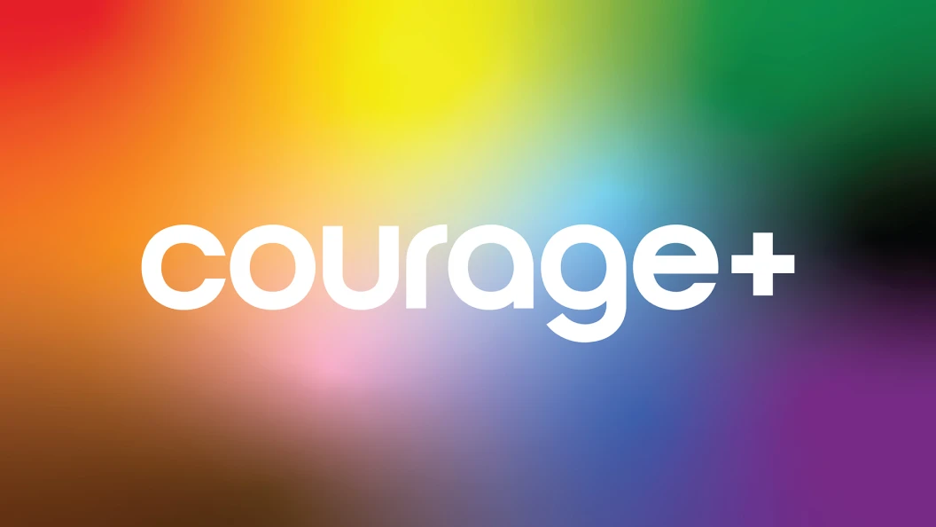
When you think of homelessness, you think of adults. But there’s another population even more vulnerable: LGBTQ+ youth. Some are as young as 12. CourageMKE (MKE is short for Milwaukee) began by offering housing, providing trauma counseling and helping Milwaukee LGBTQ+ kids one by one. But this problem is bigger than Milwaukee, and the organization felt its name and branding was holding it back from helping more LGBTQ+ youth in a larger geographic area. In other words, it needed a brand relaunch. Right away we knew we had to change their name. The client was open to starting from scratch but we felt that if we could keep the Courage part and just change the MKE part, we would still be able to retain whatever brand recognition they already had. So we decided to lose just the MKE, But then the question became, replace it with what?

About the client company

CourageMKE (MKE is short for Milwaukee) began small 10 years ago in 2015 helping Milwaukee LGBTQ+ youth one by one through:

  • Housing: Providing safe housing and transitional housing for LGBTQ+ youth at school board. The Courage House is Wisconsin’s first licensed group home for LGBTQ+ youth and the C2 Apartments are for young adults that have aged out of the foster care system.
  •  Resources: Providing scholarships, personal care kits and other resources
  • Community Education: Distributing personal care kits to community organizations and talking with GSA’s and school boards about advocating for LGBTQ+ youth
  • Trauma Informed Care: Creating a safe and affirming environment for residents to heal from trauma through therapy and safe and trained staff
     

Strategy

We started by changing the name CourageMKE. The MKE part was geographically limiting the client just to the Milwaukee area. But we wanted to keep Courage because of two reasons.
 
First, there was some equity in the name. And second, when you change a nonprofit’s name, you risk confusing donors and clients alike; we didn’t feel like we needed a blank slate. But if we kept Courage and broomed the MKE, what would we replace it with? 
 
The answer: The plus sign that is part of LGBTQ+. With the plus sign, the name now links the mission to the audience. And in a subtle way, the name now becomes an equation that demands an answer: courage + what? Courage + Love. Courage + Respect. Courage + Acceptance. Courage + Community. 
 
As for the entire brand identity system, we designed it to appeal to two very distinct audiences: donors and LGBTQ+ youth. So, we made our designs simple and iconic yet filled with color and movement. To give the rebrand new energy, we took a fresh look at the most iconic symbol of queer pride in the world: the rainbow flag.

Objectives of the campaign

The basic problem was this: A successful and very worthwhile Milwaukee-based nonprofit wanted to help more kids. It wanted to grow. But its name said “Milwaukee,” and its branding looked homespun (fine for small, grassroots organizations, but not for deep-pocketed donors). So we changed both the name and the brand identity system, and we relaunched the brand to appeal to two audiences: donors who wanted to see a polished, legitimate organization; and LGBTQ+ youth, whom they needed to connect with on an emotional level.

Media, channels or techniques use

This rebranding had to make our clients look like a serious, legitimate organization when they approached donors, but they also had to connect with at-risk teenagers. So we made the designs simple and iconic. Yet filled with color and movement. 
 
To give the rebrand new energy, we took a fresh look at the most iconic symbol of queer pride in the word, the rainbow flag. One of the interesting things about the rainbow flag is that there are actually 15 of them, each representing different identities (Lesbian, Gay, Bisexual, Trans, Non-binary, etc.) But the hard lines of the stripes are also walls of separation. So, we softened the edges into gradients of color. With this system of gradients, everyone in the Courage+ family can express their most authentic selves. Staff can select the colors that resonate with them for their business cards, supporters can buy a shirt that reflects their unique identity. The gradients are also a convenient device to customize photography for social media. As a non-profit, they cannot always hire a professional photographer, and images might come from a variety of sources. By using the gradients as a photo filter, they can easily brand and elevate any image. 
 
The rebranding was unveiled and announced as a surprise to attendees of their annual gala in the fall of 2024. Soon after the roll-out of the rebrand took place in early 2025 through a multi-channel campaign on social media, 1:1 own digital properties, at events and a nationwide media blitz that started right in Milwaukee.

Budgets

We provided this work probono, but we completed this campaign for around $300,000.

Results

The unveiling of the brand relaunch at the client’s annual gala was the largest fundraising event in the organization’s history, with an increase of 62% from the year before. That total equated to $180,000 funds raised in just one night!

Client Testimonial

Below is an email that we received from the client while working on this launch. We think itabout sums it up.
 
Seems like everywhere we look right now, there’s a lot of darkness. So, I just want to take amoment to say thank you—from the bottom of my heart—for the JOY you bring into our lives.Every time your names pop up in our emails, we see your faces on our screens, or, on thosereally special days, when we get to be together in person—we are reminded that even in thehardest times, love still shines through. For those few moments, we get to forget the ugly andhold onto the light.Truly, thank you for being the incredible humans you are. Your kindness, your love, and yourunwavering support mean the world to us. Because of you, our lives are brighter—every singleday.

More case studies

Content Strategy & MarketingCreative & DesignEvent Marketing