OVERVIEW
When you think of homelessness in America, you think of adults. But there’s another population even more vulnerable: LGBTQ+ youth. Some are as young as 12. A few years ago, an organization set out to address this problem. CourageMKE (MKE is short for Milwaukee) began small by offering housing, providing trauma counseling and helping Milwaukee kids one by one. But this problem is bigger than Milwaukee, and the organization felt its name and branding was holding it back from helping more LGBTQ+ youth in a larger geographic area. In other words, it needed a brand relaunch.
Objectives
The basic problem was this: A successful and very worthwhile Milwaukee-based nonprofit wanted to help more kids. It wanted to grow. But its name said “Milwaukee,” and its branding looked homespun (fine for small, grassroots organizations, but not for deep-pocketed donors). So we changed both the name and the brand identity system, and we relaunched the brand to appeal to two audiences: donors who wanted to see a polished, legitimate organization; and LGBTQ+ youth, whom we needed to connect with on an emotional level.
STRATEGY
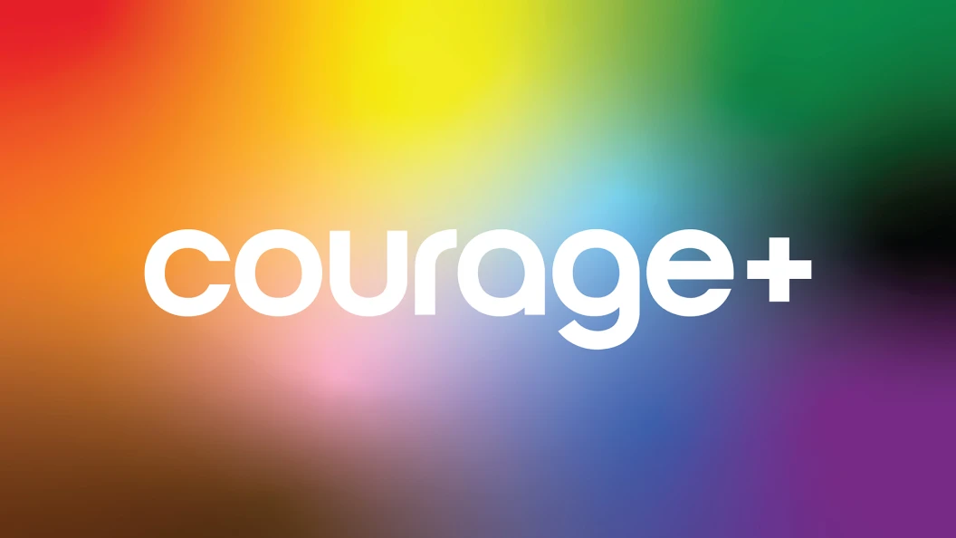
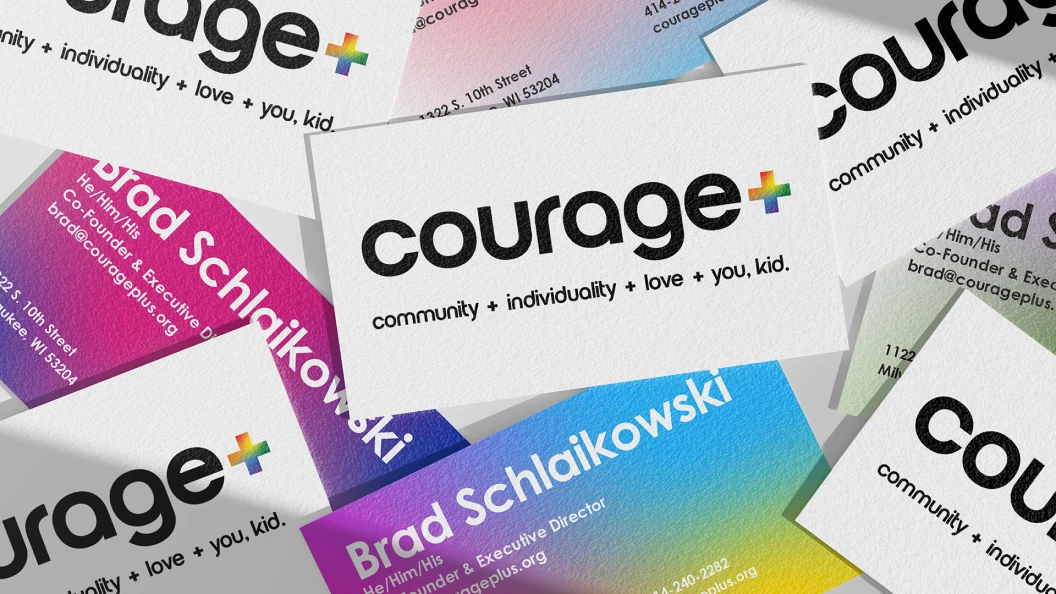
We started by changing the name CourageMKE. The MKE part was geographically limiting us just to the Milwaukee area. But we wanted to keep Courage because of two reasons. First, there was some equity in the name. And second, when you change a nonprofit’s name, you risk confusing donors and clients alike; we didn’t feel like we needed a blank slate. But if we kept Courage and broomed the MKE, what would we replace it with? The answer: The plus sign that is part of LGBTQ+. With the plus sign, the name now links the mission to the audience. And in a subtle way, the name now becomes an equation that demands an answer: courage + what? Courage + Love. Courage + Respect. Courage + Acceptance.
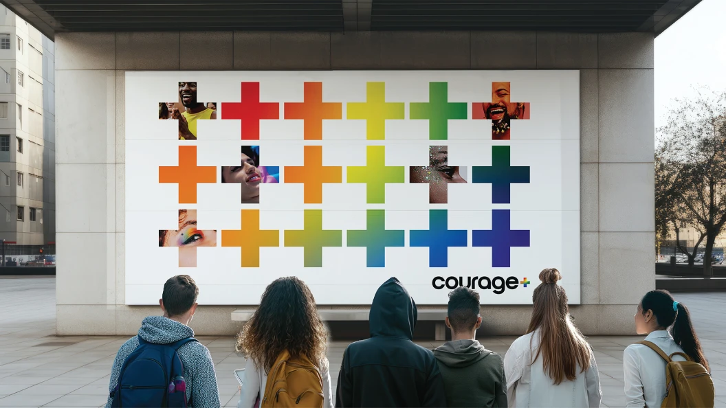
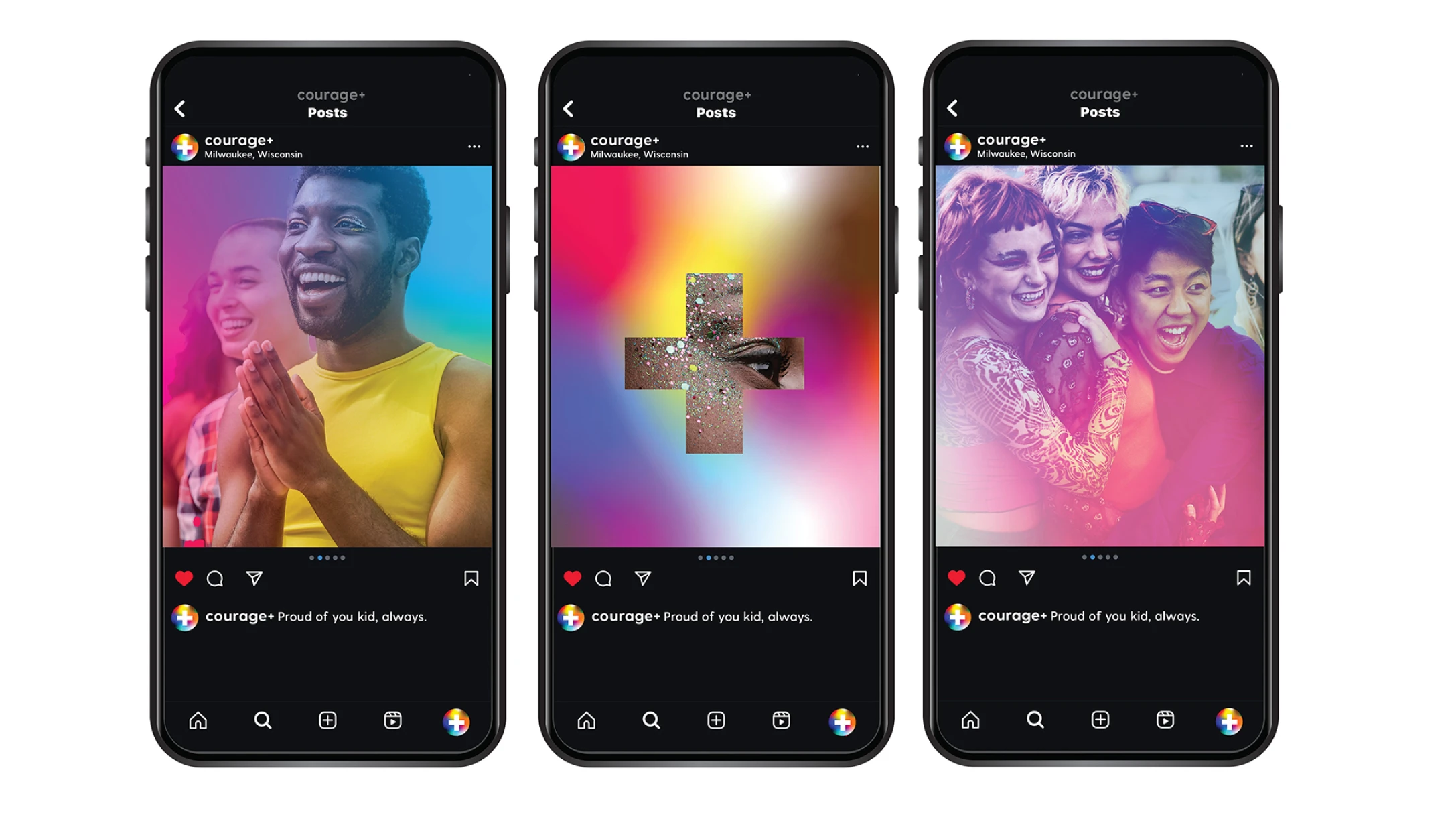
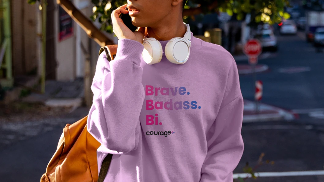
Courage + Community. As for the entire brand identity system, we designed it to appeal to two very distinct audiences: donors and LGBTQ+ youth. So, we made our designs simple and iconic yet filled with color and movement. To give the rebrand new energy, we took a fresh look at the most iconic symbol of queer pride in the world: the rainbow flag. One of the interesting things about the rainbow flag is that there are actually 15 versions, each representing different identities (lesbian, gay, bisexual, trans, nonbinary, etc.). But the hard lines of the stripes are also walls of separation. So, we softened the edges into gradients of color. With this system of gradients, everyone in the Courage+ family can express their most authentic selves. Staff can select the colors that resonate with them for their business cards, and supporters can buy a shirt that reflects their unique identity.
The gradients are also a convenient device to customize photography for social media. As a nonprofit, they cannot always hire a professional photographer, and images might come from a variety of sources. By using the gradients as a photo filter, the client can easily brand and elevate any image.
THE RESULTS
Fundraising increase
The unveiling of the brand relaunch at the client’s annual gala was the largest fundraising event in the organization’s history, with an increase of 62% from the year before. But we won’t be stopping there. On the horizon for this year, we will be publicly launching the new brand as we head into Pride season through a relaunch campaign that was born from deeper brand strategy work, along with PR activations that will target potential donors and outreach activations targeted at LGBTQ+ youth and young adults throughout Wisconsin and beyond.